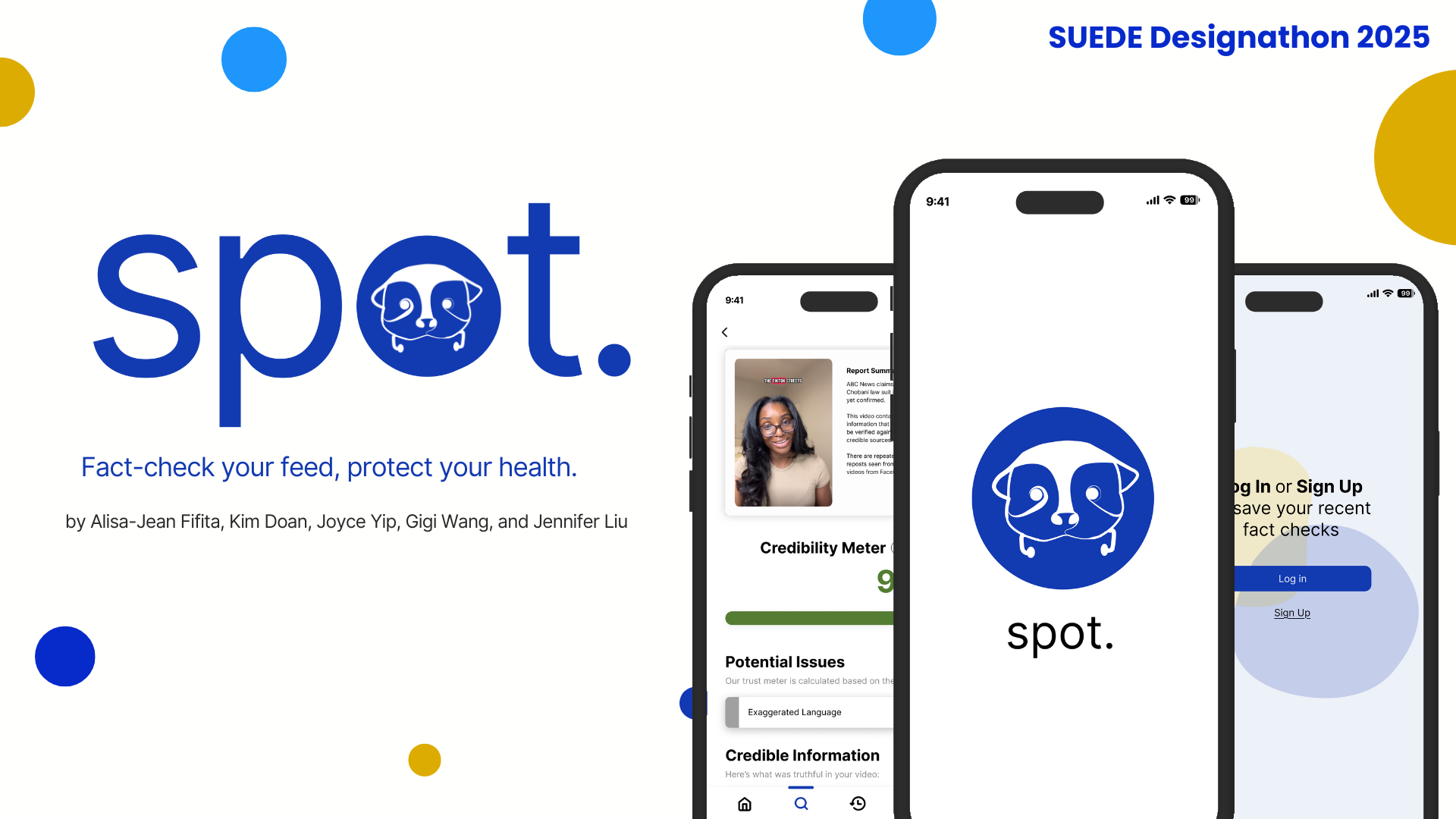
spot.
User ExperienceUser InterfaceFigmaOver 48 hours at the SUEDE Designathon, our team of five tackled the challenge of designing a digital solution to support mindful digital engagement, focusing on medical misinformation online. We all contributed to primary research, with me specifically conducting online ethnography, observations, and some interviews. I also led much of the UI design and prototyping, helping create a solution that makes it easy for users to identify and navigate misinformation.
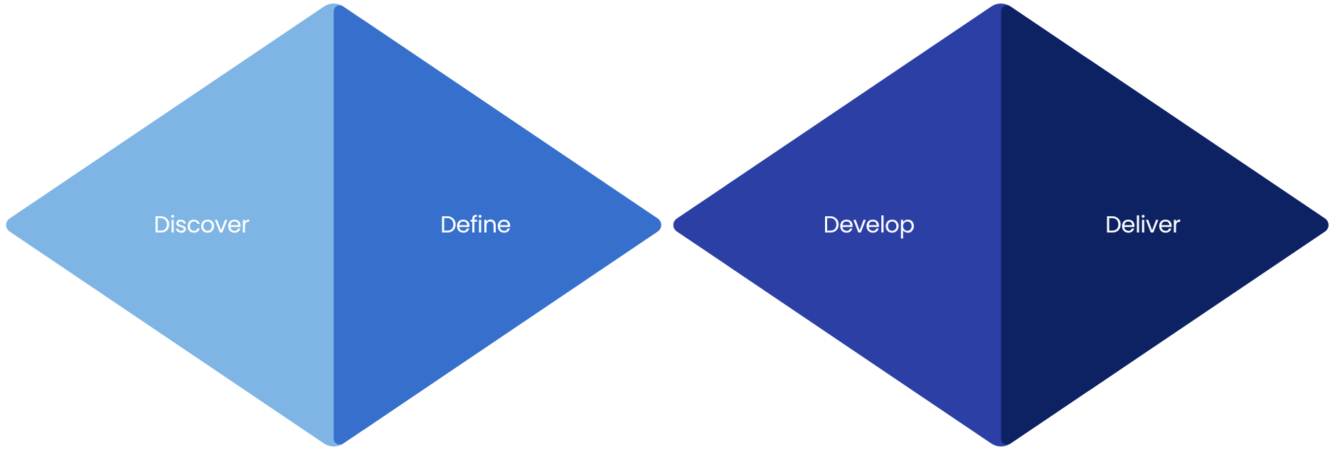
Our Process
We followed the Double Diamond framework to guide our 48-hour designathon project. Through research, synthesis, ideation, and prototyping, our team explored the problem of medical misinformation online and developed a solution that supports mindful digital engagement.
Discover
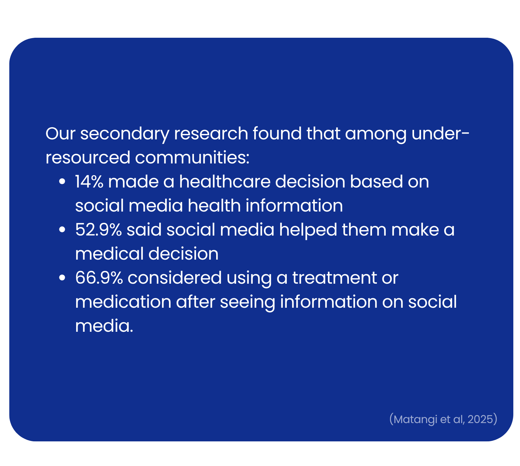
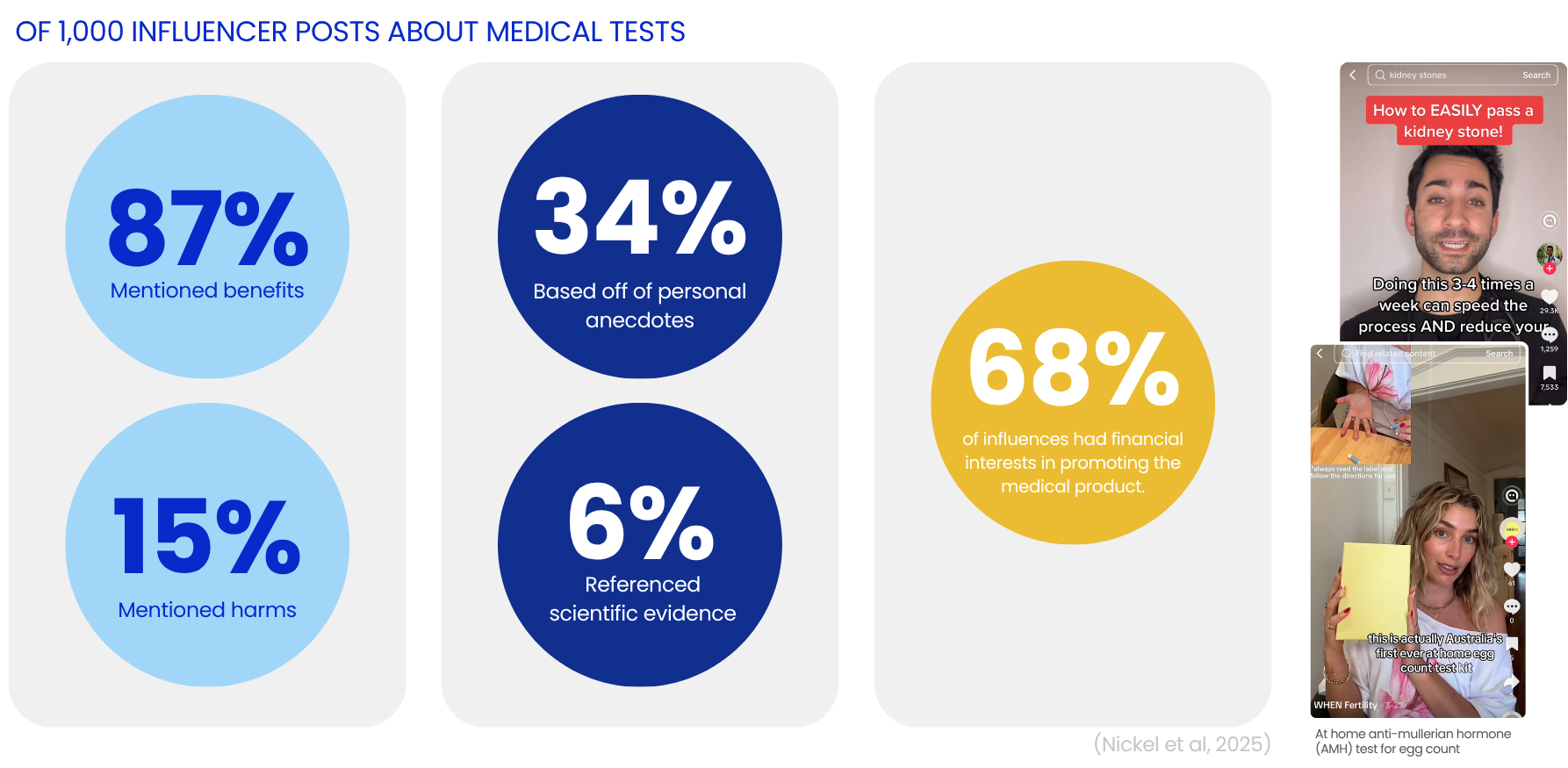
Secondary Research
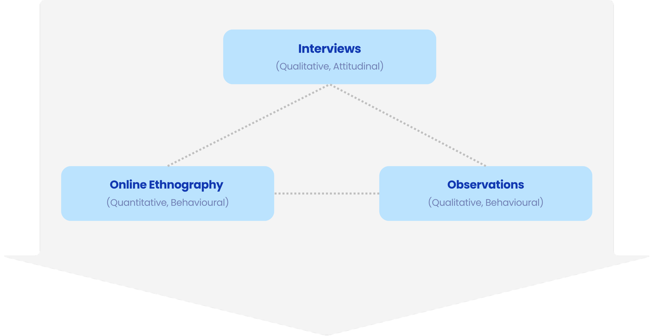
To understand how users engage with digital information and encounter medical misinformation, our team conducted primary research, including a speed interviewing workshop and online ethnography, alongside secondary research. I specifically led the online ethnography, observations, and some interviews, gathering insights into user behavior, pain points, and strategies for identifying misinformation.
Primary Research
Define
We analysed our research data using an affinity diagram, which helped us uncover key insights about how users navigate and assess digital information. From these insights, we crafted a revised problem statement that guided our design direction.
Data Analysis
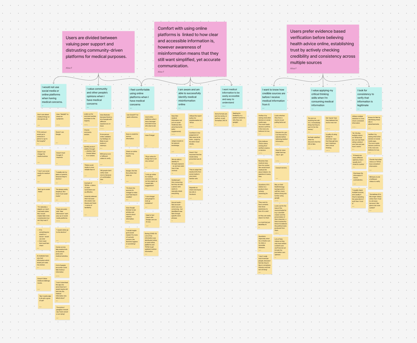
Affinity Diagram
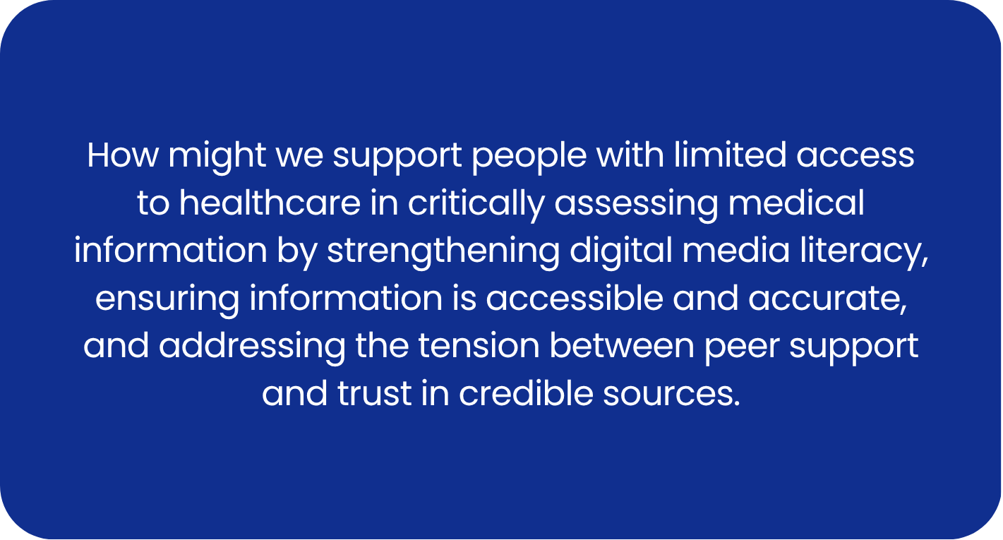
Revised Problem Statement
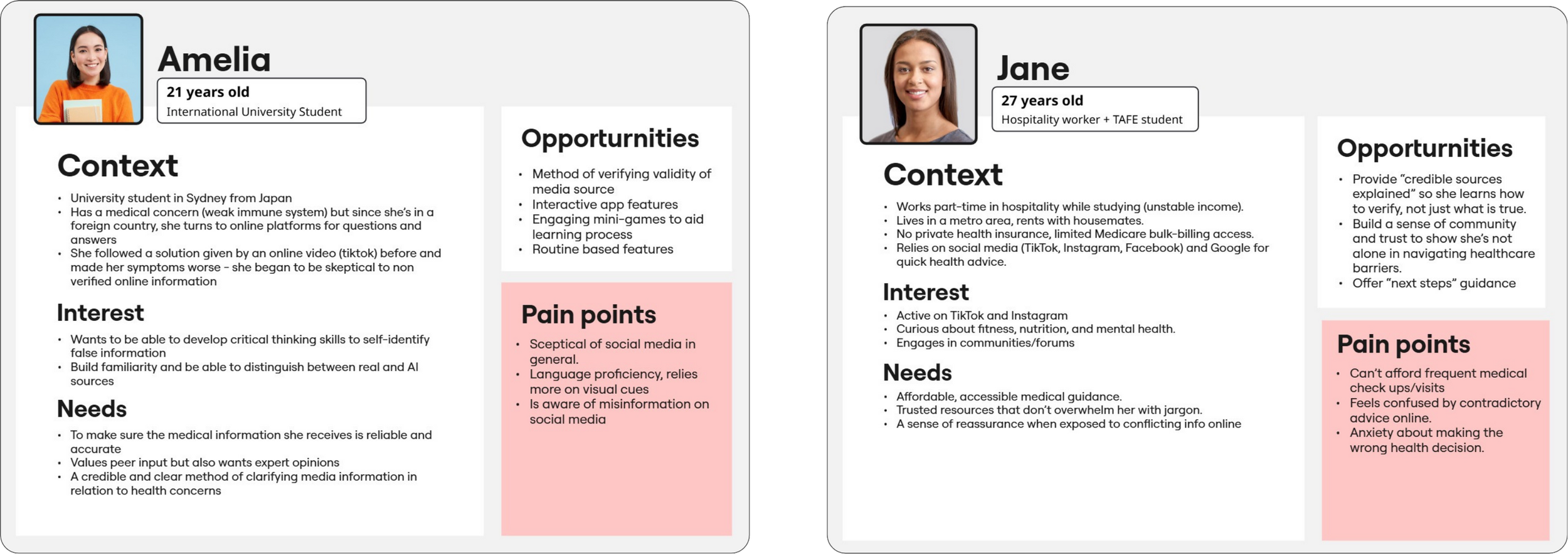
After refining our problem statement, we moved into data synthesis to translate our insights into tangible design tools. We created user personas to represent our target users, highlighting pain points and opportunities for intervention. These artifacts grounded our ideation in real user needs.
Data Synthesis
Develop
We began with brainstorming sessions to generate a wide range of concepts. To refine our direction, we participated in a mentor workshop, where we received feedback on improving the seamlessness between social media use and our app. Using this feedback, we iterated on our ideas, focusing on smooth transitions and intuitive interactions. From there, we moved into wireframing, laying the foundation for our prototype.
Ideation

Wireframes
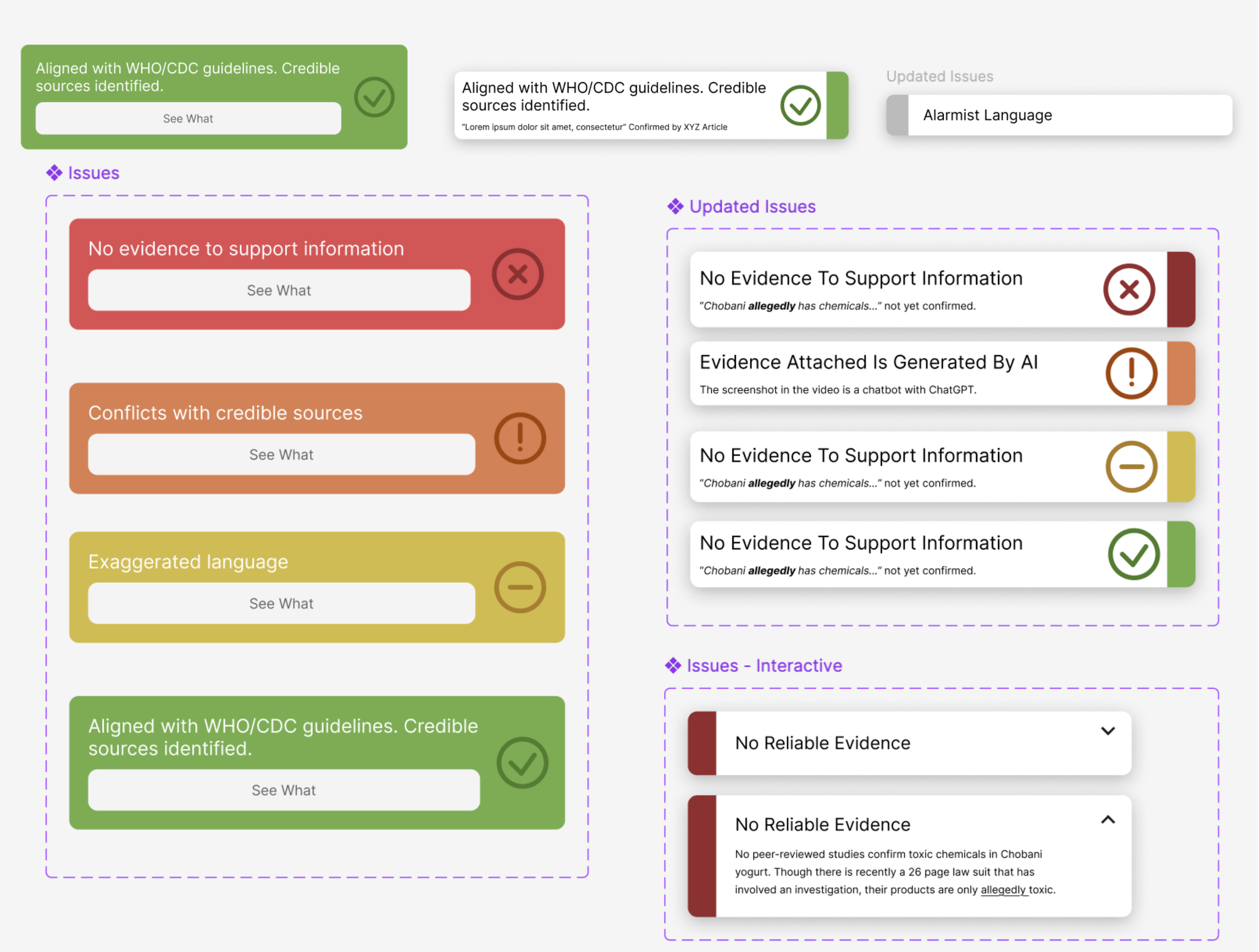
For user testing, we ran a think-aloud protocol, making quick changes using an agile approach. Feedback revealed that:
The icons were overwhelming, so we simplified the visual system.
Four color categories felt contradictory, so we reduced them to three.
Titles and summaries clashed, so we collapsed extra details into a “Learn More” section.
These rapid iterations made the design clearer, less overwhelming, and more intuitive.
Iteration
Deliver
In the final phase, we created a high-fidelity prototype that showcased how users could seamlessly transition from social media into our app to verify and engage with medical information. I focused heavily on the UI design and prototyping, ensuring the interface was clear, accessible, and intuitive.