Trustly
User ExperienceInterface DesignFigmaResearch & Ideation
Watch this video about the concept, problem area, background research, and early ideation behind Trustly.
Iteration
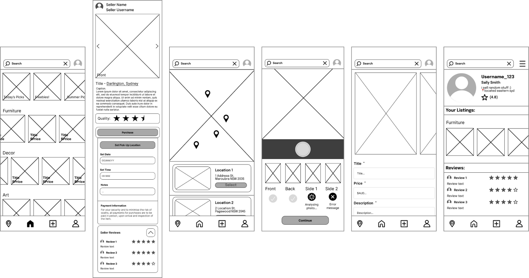
Wireframes
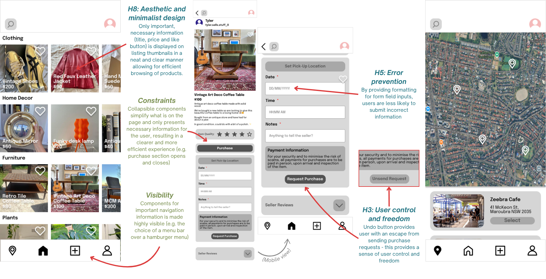
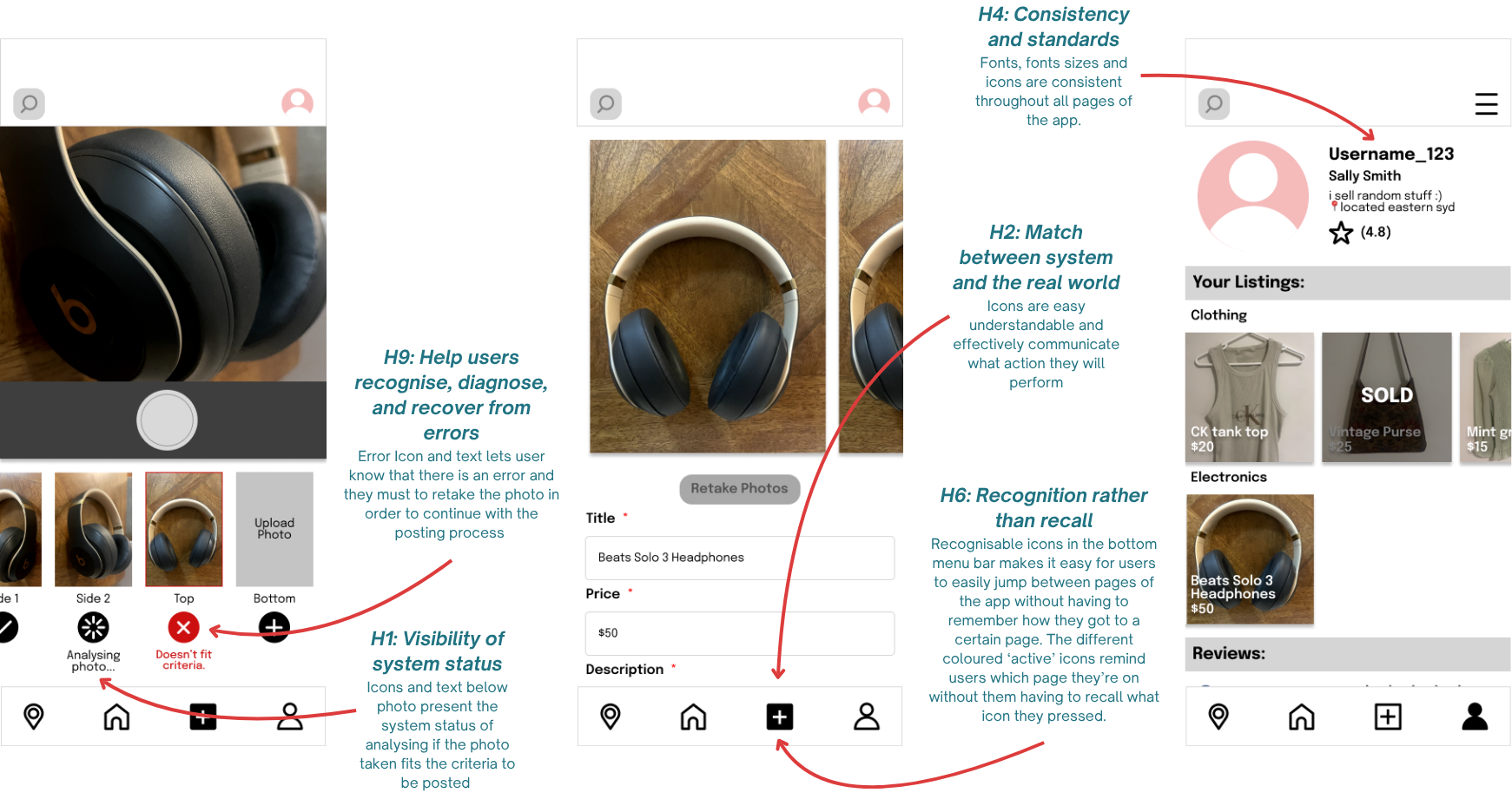
Design principles are annotated in green and Neilsen’s Usability Heuristics are annotated in blue.
Hi-Fidelity Screens
User Testing
Methodology
The methodology for usability evaluation included user testing, through the think-aloud method, post-test interviews, and System-Usability-Survey (SUS) Questionnaires - and heuristic evaluation. The overall objectives for the usability evaluation were: users can easily navigate through the app with no difficulty, users can efficiently find the product they are looking for, users can successfully assess the quality and price of the product, users feel a sense of safety in their experience. 4 participants of varied experiences and skill in using online C2C marketplaces were tested. The participants also had varied ages, socioeconomic backgrounds and technological skill levels. The testing was performed in person. The equipment used was an iPhone for the LOFI prototype, iPad with Microsoft Word’s ‘text-to-speech’ feature enabled to transcribe the tests, the usability test observation form and the Interaction Design Foundation SUS template.
Think Aloud
Outcomes:
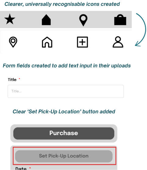
Bottom menu icons did not communicate where they would take users: “I don’t really know what the star is”
Users were unsure of how to set a location and communicate it with the seller: “Wait, am I meant to click it? Or do I just see where I can pick it up from?”
Users were unsure of how to add text details to their listings: “How do I add the title?”
Interviews
Outcomes:
Bottom menu icons did not communicate where they would take users: “I don’t really know what the star is”
Participants weren’t able to rely on the listing photos and needed more text to signify what the items were: “Maybe if it had like titles or something […] that would kind of help.”
Participants found it easy to assess the product quality and seller reliability.
Participants were confused about how to set pick-up locations: “I just didn’t know how to like actually set the location rather than just look at it.”
System Usability Survey
Outcomes:
The SUS score was 82.5. This was above the goal score and above the average score, however not above excellent (85+).
Heuristic Evaluation
Outcomes:
Out of 6 issues found during testing there were:
2 usability catastrophes
2 major usability problems
1 minor usability problem
1 cosmetic problem
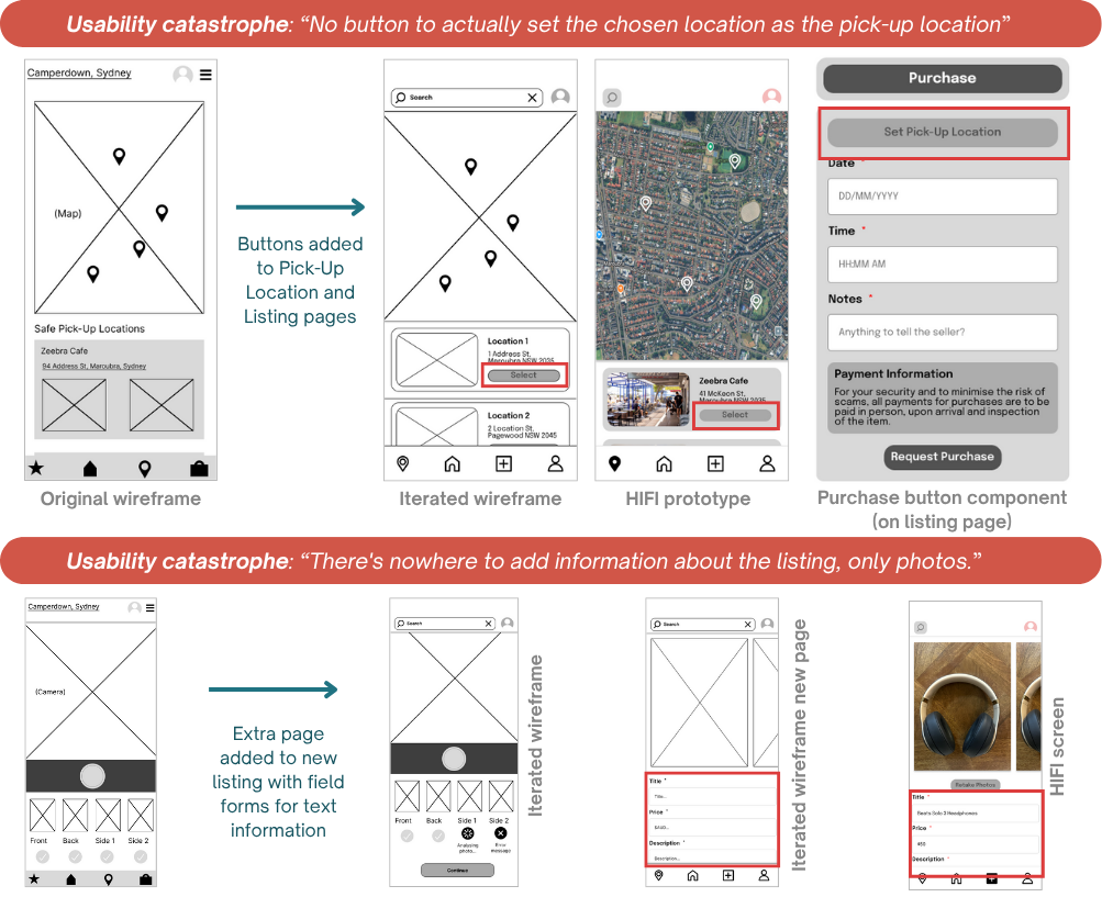
Further Iteration
Final Prototype
Explore the final Trustly prototype!